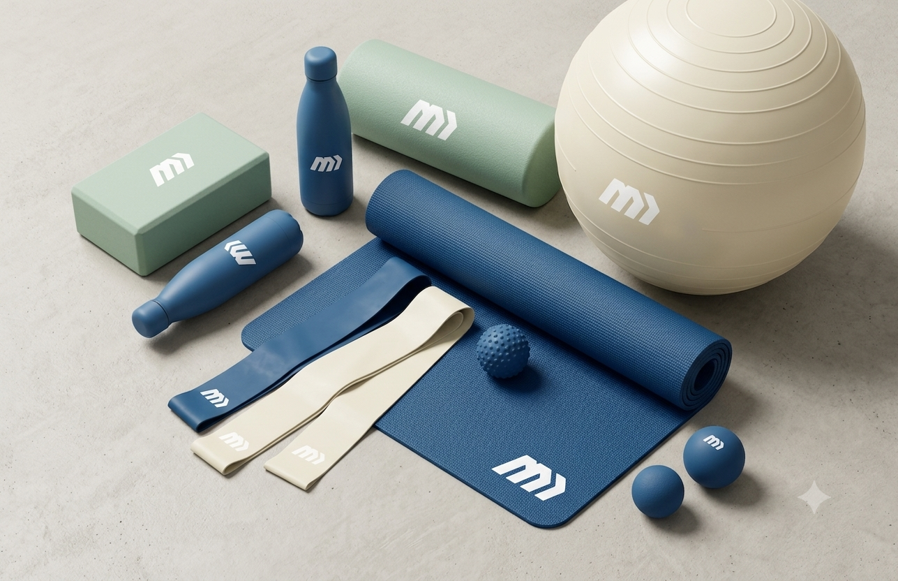
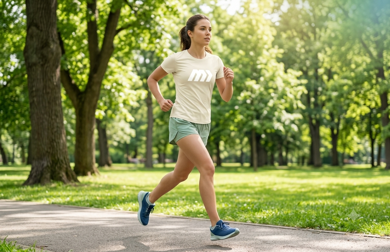
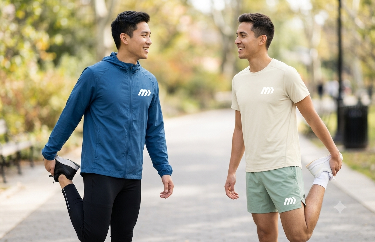
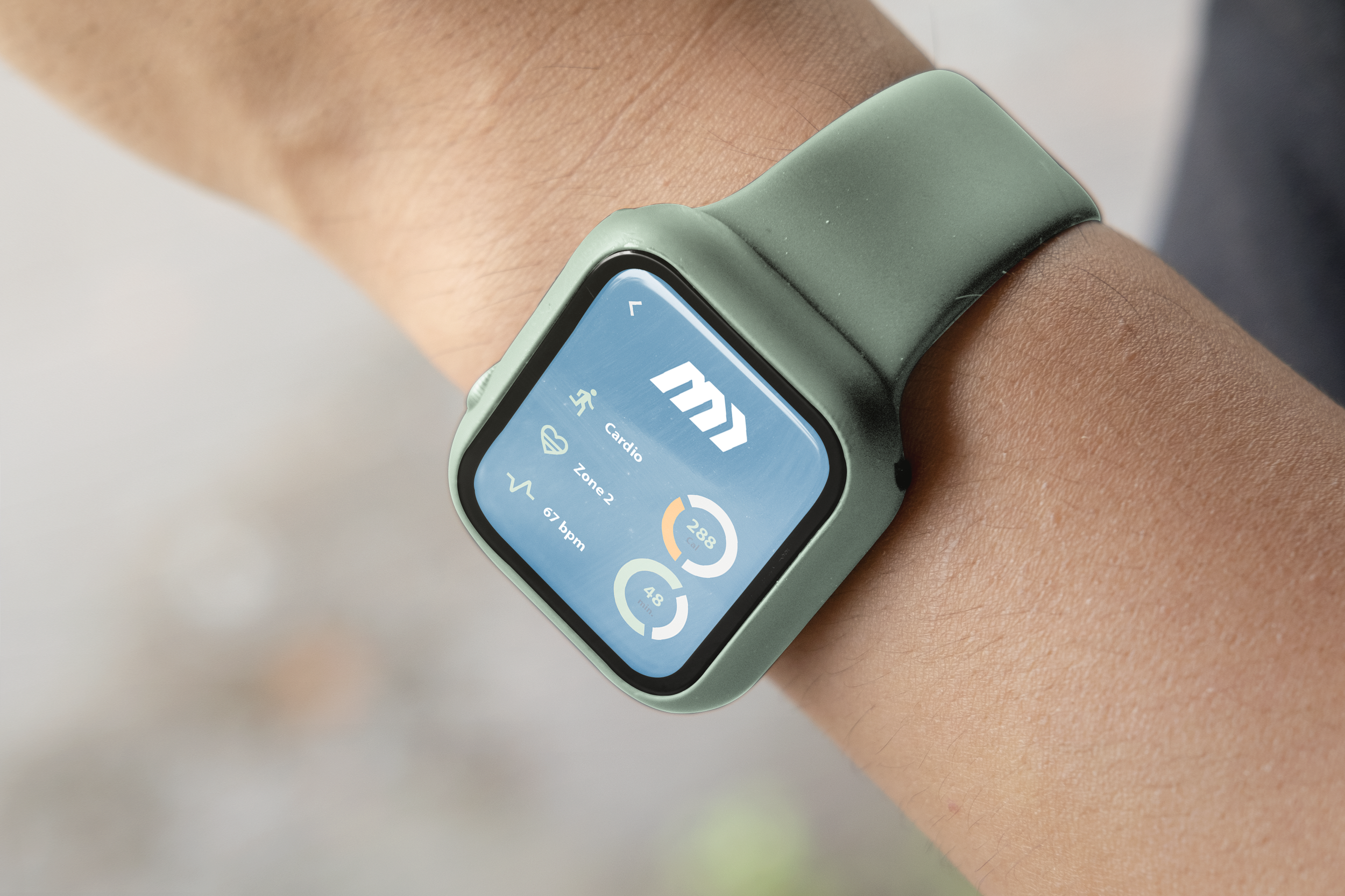
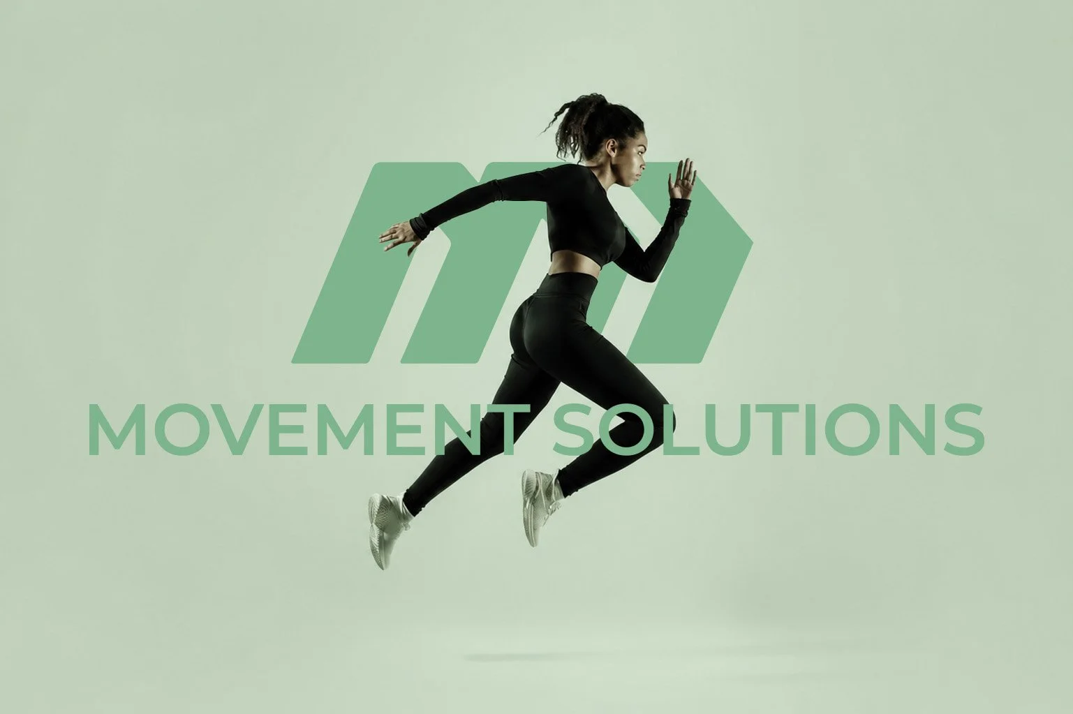
Movement Solutions
The mark is precisely engineered using three parallel diagonal bars that culminate in forward-pointing chevrons. This deliberate, forward-leaning slant cleverly modernizes the letter "M" while dynamically mimicking the momentum of people running. By doubling as an abstract representation of legs in motion, the geometry visualizes the brand's core focus on active rehabilitation and keeping the body in forward motion.