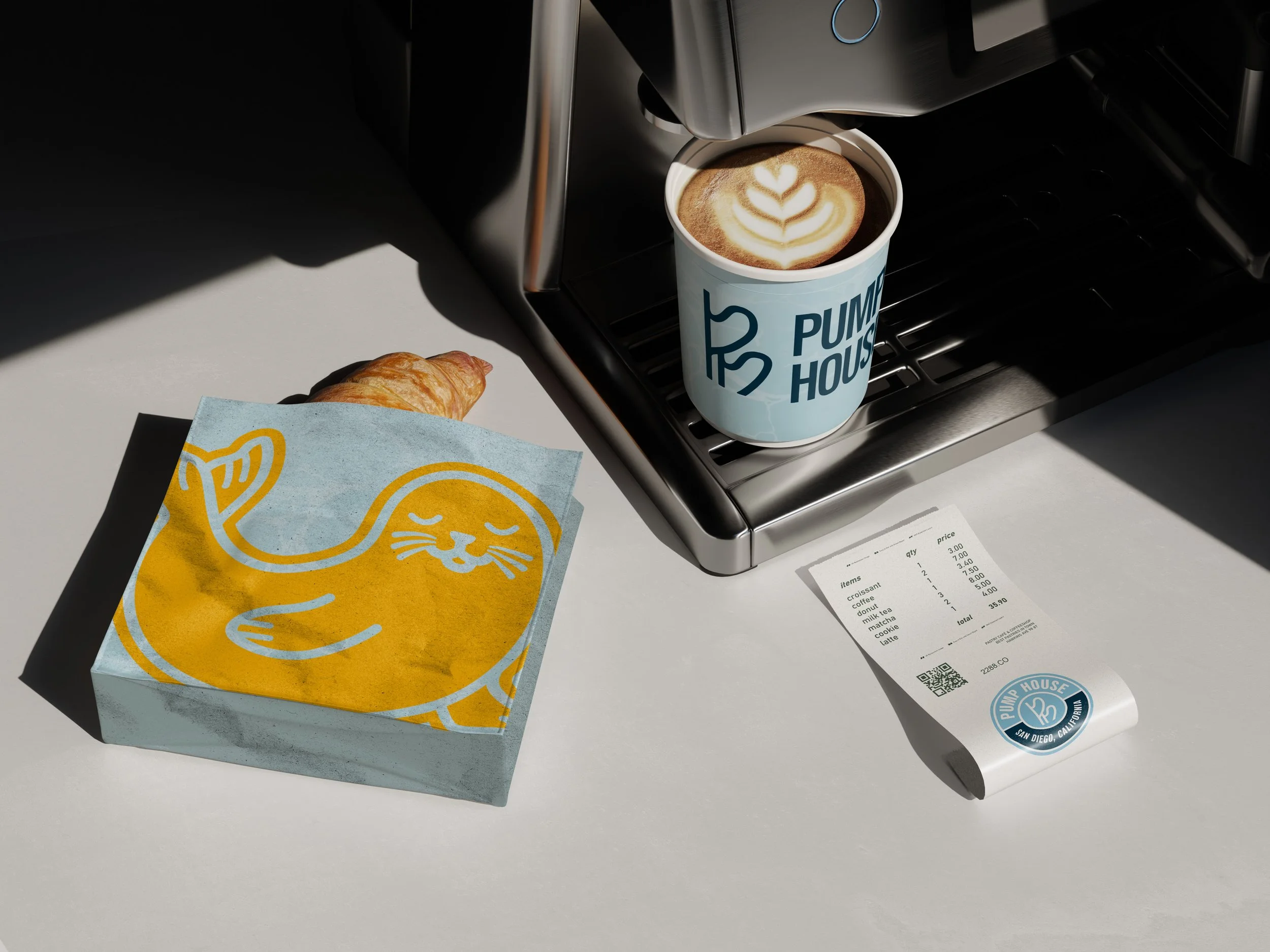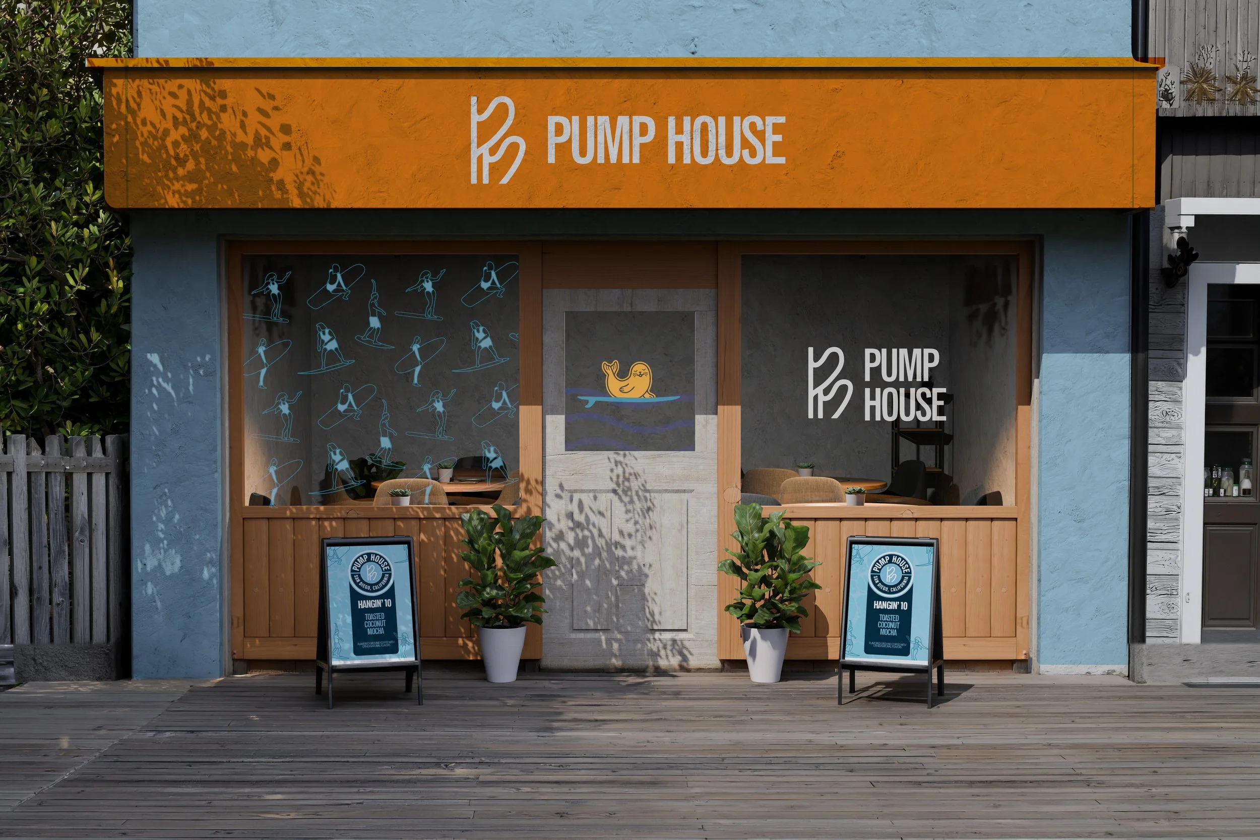
PUMP HOUSE
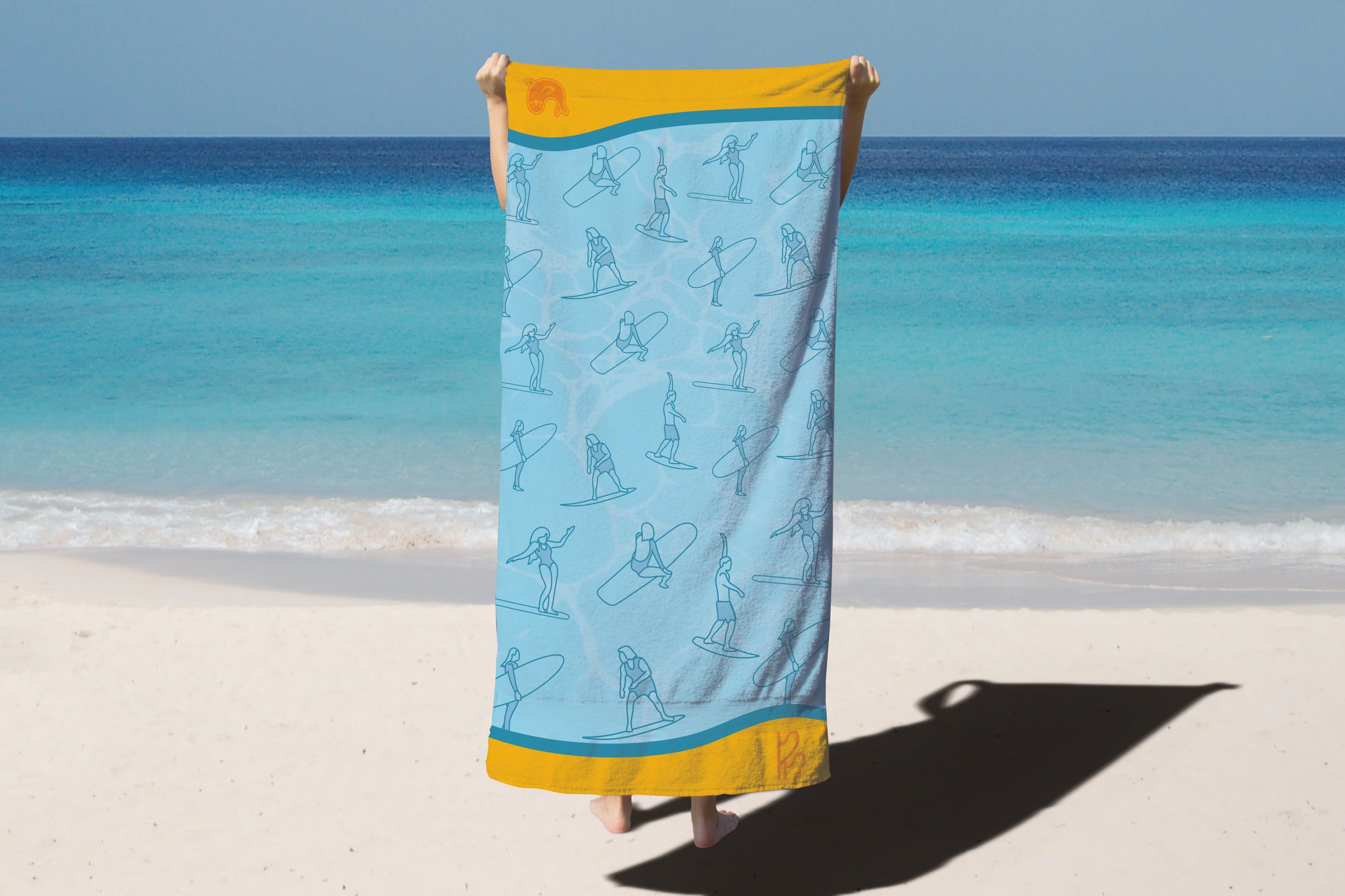
Pump House needed an identity that captured the welcoming, laid-back energy of local surf culture. We built a brand for this coastal beach cafe and bar that feels exactly like a sunny afternoon hanging out by the water—approachable, inclusive, and ready for a good time.
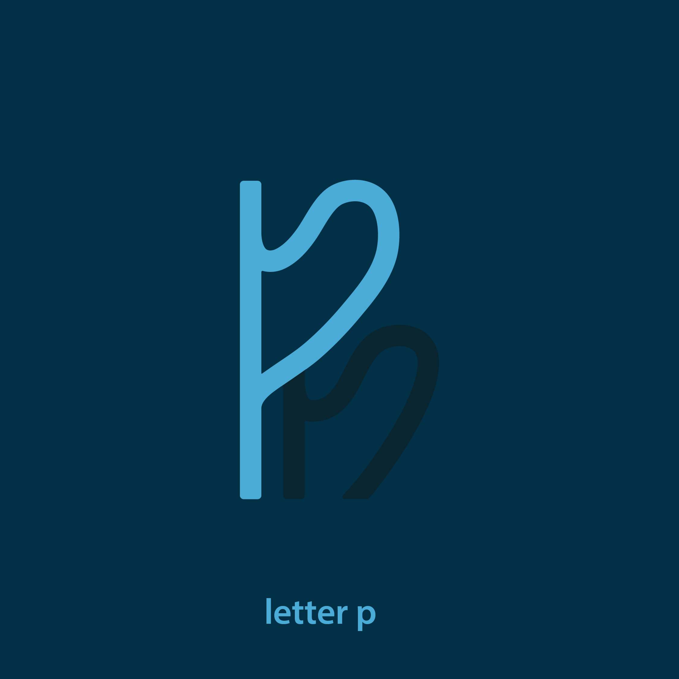
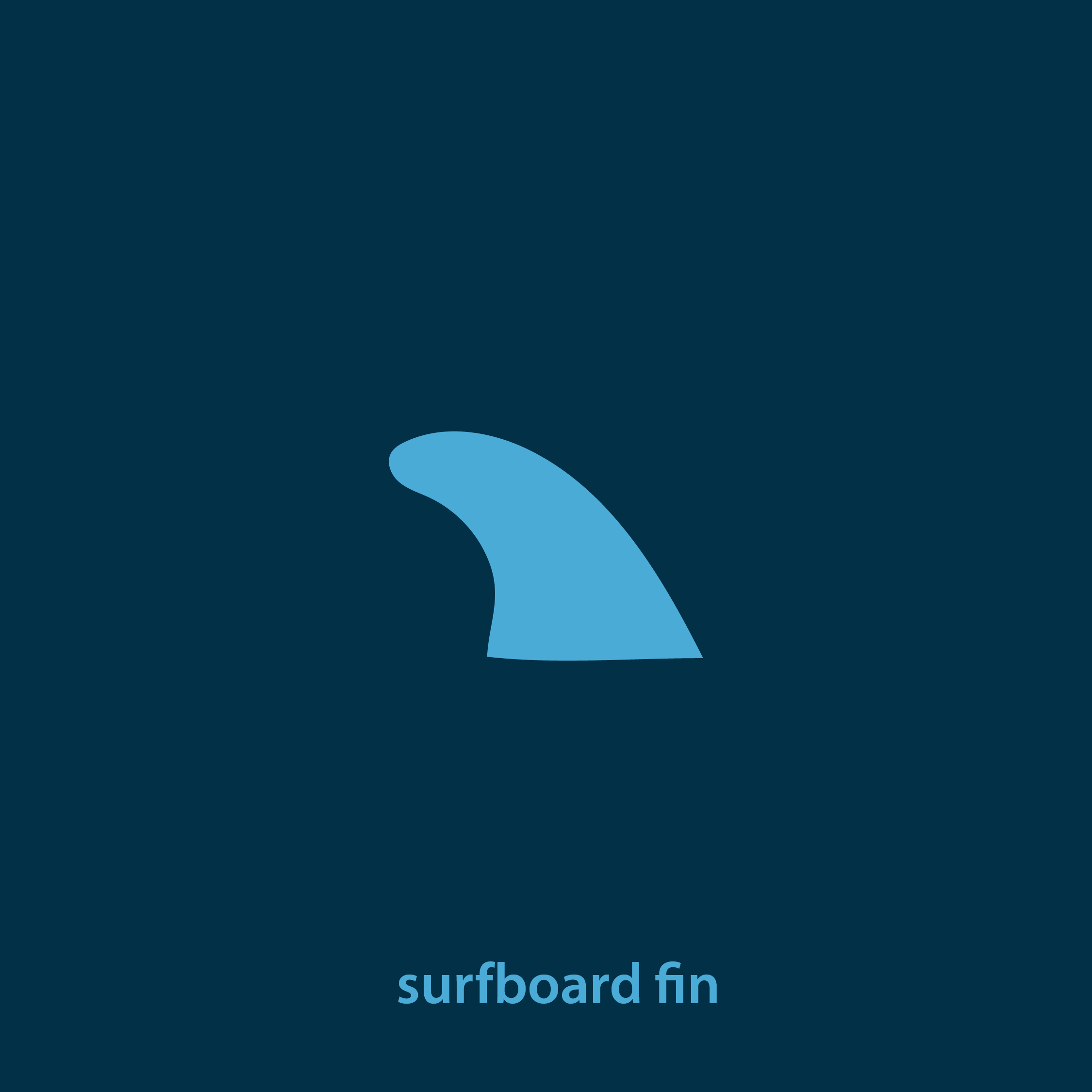
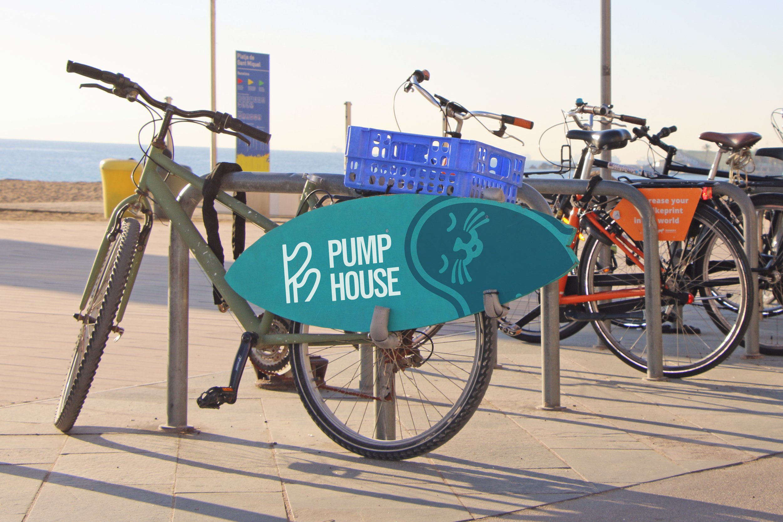
The visual identity of Pump House is anchored in the inclusive, supportive spirit of true coastal living. At its core is a clever monogram that intertwines the distinct silhouettes of a longboard fin and a shortboard fin, a thoughtful nod to surf culture that acts as a visual handshake, signaling that all riders and beachgoers are equally welcome. This unifying symbol is brought to life through a warm, sun-baked color palette inspired by everyday beach life, capturing the golden hour hues and sun-bleached sands of the coast. Together, these design elements craft a relaxed, approachable brand presence that matches the inviting energy of a local surf-themed community hangout.


The idea behind the mark
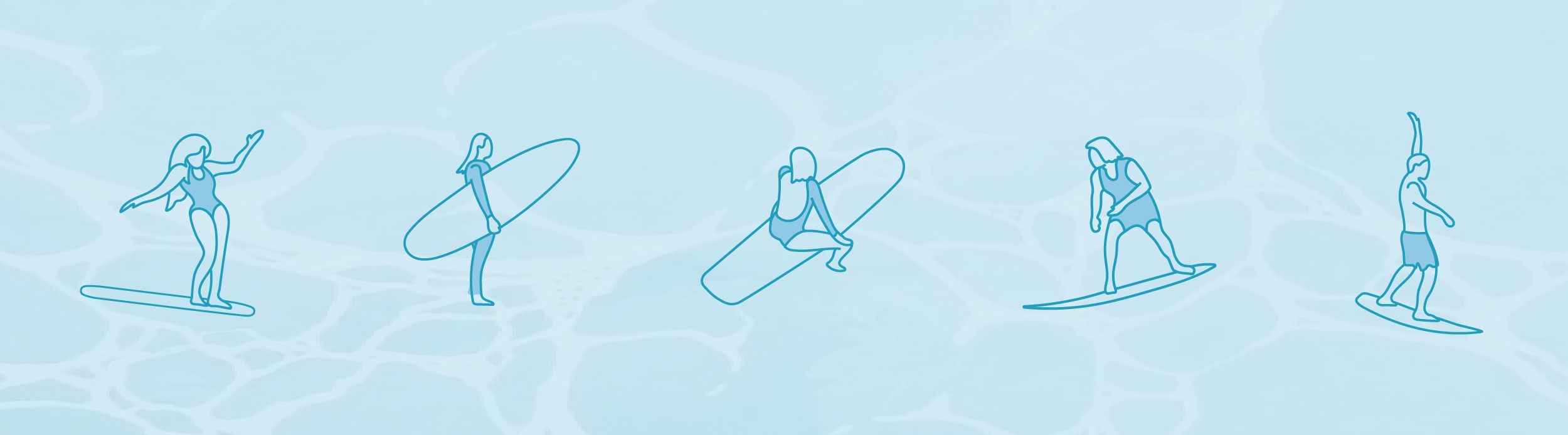
The mark captures the soulful duality of surf culture, using the literal anchor of a surfboard—the fin—as a metaphor for community. Whether you glide on a single log or shred on a thruster, the equipment changes, but the playground remains the same. The mark visually bridges the gap between different styles of riding, celebrating the diverse ways we approach the wave while honoring the single, unifying connection: a shared love for life in the ocean.